Add your logo, browser-tab icon and brand color, and choose how group pages look.
Any Community Admin can do this. A logo is one of the 6 checks you need to go live.
Steps
- In Studio, go to Settings → Branding.
- Under Logo and icons, click Upload for each picture you want.
- Under Primary brand color, pick a swatch, use the color square, or type a 6-character code like
2F6AE0. The Preview row shows your buttons in that color. - Under Group pages, pick Standard or Compact.
- Click Save changes. You see "Changes saved successfully."
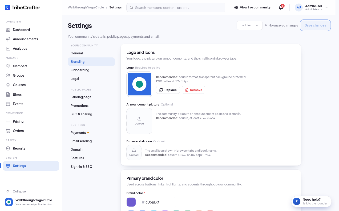
The pictures
| Picture | Where members see it | Best size |
|---|---|---|
| Logo (required to go live) | The header and emails | Square, at least 512 × 512 px, transparent background if you can |
| Announcement picture (optional) | Your community's picture on announcement posts and in emails | Square, at least 256 × 256 px |
| Browser-tab icon (optional) | Browser tabs and bookmarks | Square, 32 × 32 or 48 × 48 px, PNG |
Every picture must be JPG, PNG, WebP or GIF, up to 10 MB. Logged-out visitors can see these pictures. Use Replace or Remove to change one.
Brand color
Buttons, links and emails use your brand color. Studio refuses a color that is too light, too grey, or that makes button text hard to read. Choose a stronger shade if you see one of these messages:
- "This color is too light and may not be clearly visible as a button or link. Please choose a darker shade."
- "This color appears too neutral or grey. Please choose a more vibrant color for better visibility."
- "This color does not provide enough contrast for readable button text. Please choose a stronger shade."
Group pages
This changes every group page in your community.
| Option | What members see |
|---|---|
| Standard (default) | A large cover image at the top. |
| Compact | Posts first. The group image moves into the sidebar. |